
Can Colors Improve Focus? Psychology Insights on Calming Colours and Mental Health
The relationship between color and human psychology has fascinated researchers for decades. While we often overlook the subtle environmental factors in our workspaces, the colors surrounding us profoundly influence our cognitive performance, emotional state, and ability to maintain focus. Recent neuroscience studies demonstrate that specific wavelengths of light trigger distinct neurological responses, affecting everything from stress hormone production to attention span duration.
When you’re struggling to concentrate on complex tasks, the culprit might not be your willpower or discipline—it could be your environment’s color palette. Understanding how calming colours mental health intersect provides actionable insights for anyone seeking to optimize their workspace for sustained attention and reduced anxiety. This exploration bridges psychology, neuroscience, and practical design principles to help you harness color’s remarkable power.
The Neuroscience Behind Color and Focus
Color perception begins in the retina, where specialized cells called photoreceptors respond to different light wavelengths. These signals travel through the optic nerve to multiple brain regions, including the suprachiasmatic nucleus (which regulates circadian rhythms) and the amygdala (which processes emotions). This biological pathway explains why colors don’t merely create aesthetic preferences—they fundamentally alter our neurological state.
Research from Nature Neuroscience reveals that blue wavelengths, specifically in the 460-480 nanometer range, suppress melatonin production and enhance alertness. Conversely, longer wavelengths like red and orange stimulate melatonin release, promoting relaxation. Understanding this mechanism helps explain why certain colors support focus while others induce drowsiness or anxiety.
The prefrontal cortex—your brain’s executive control center responsible for attention, decision-making, and impulse control—shows heightened activation when exposed to specific color environments. Studies using functional MRI imaging demonstrate that cool colors like blue and green increase prefrontal cortex activity, enhancing working memory capacity and sustained attention spans. This neurological response occurs automatically and unconsciously, making environmental color choices surprisingly impactful.
Beyond immediate neurological effects, colors influence our cortisol levels and heart rate variability. Prolonged exposure to jarring colors (like intense reds or yellows) elevates cortisol, your body’s primary stress hormone, which impairs cognitive function and memory consolidation. Conversely, exposure to calming color environments reduces cortisol production, creating optimal conditions for deep focus and learning.
Best Colors for Concentration and Mental Clarity
Blue stands as the premier color for focus and cognitive performance. Its association with clear skies and calm waters carries evolutionary significance—our ancestors recognized blue environments as safe, resource-rich spaces. Modern neuroscience confirms this intuition: blue increases alertness without inducing anxiety, enhances problem-solving abilities, and supports sustained attention for extended periods. Light to medium blues prove most effective; extremely dark or bright blues can feel overwhelming.
Green represents nature’s restorative color, triggering what researchers call the “attention restoration theory.” After intensive focus sessions, viewing green spaces or green-toned environments allows directed attention to recover. This makes green ideal for environments where you alternate between demanding cognitive tasks and recovery periods. Studies show that even small potted plants or green wall art significantly improve concentration and reduce mental fatigue.
For those seeking calming colours for mental health combined with focus enhancement, soft gray and neutral beige provide excellent foundations. These colors minimize visual stimulation without inducing boredom, creating what psychologists call “optimal arousal”—the mental state where focus flourishes. They work particularly well for extended work sessions because they don’t fatigue the visual system.
Learn more about implementing these colors strategically by exploring our guide on calming colors for mental health, which provides detailed recommendations for different spaces and situations.
Purple occupies an interesting middle ground, combining blue’s calming properties with red’s energizing elements. Lighter purples support creative thinking and intuitive problem-solving, making them suitable for brainstorming or strategic planning sessions. However, darker purples can feel heavy and may reduce focus if used excessively.
How Different Colors Affect Stress Response
Understanding the full spectrum’s psychological impact requires examining how colors influence your nervous system. Your autonomic nervous system exists in two states: sympathetic (fight-or-flight) and parasympathetic (rest-and-digest). Colors either activate or suppress these responses.
Red stimulates the sympathetic nervous system, increasing heart rate and blood pressure. While this heightened arousal can boost short-term motivation, prolonged red exposure elevates stress markers and impairs sustained concentration. Red works best in small accents or brief motivational contexts rather than as a primary workspace color.
Orange and yellow occupy similar territory, promoting energy and optimism. However, excessive exposure—particularly bright yellows—can overstimulate and create anxiety. These colors work best as accent elements rather than dominant environmental colors for focus-intensive work.
Black and dark gray create feelings of heaviness and formality. While occasionally useful for establishing professional boundaries, extensive dark color exposure can increase depressive symptoms and reduce motivation. Balance dark colors with lighter complementary tones.
The contrast between colors matters significantly. High-contrast color combinations (like bright red on white) create visual strain and cognitive load, making focus more difficult. Lower-contrast combinations (like blue-green on light gray) reduce visual processing demands, freeing cognitive resources for your actual work.
Research on color psychology from the American Psychological Association emphasizes individual variation in color response. While these general principles apply broadly, personal experiences, cultural backgrounds, and even color associations from significant life events influence how you respond to specific colors. Your subjective response matters—if a color genuinely calms you despite general recommendations suggesting otherwise, that response reflects your unique neurobiology and psychology.
Implementing Color Psychology in Your Workspace
Practical application of color psychology begins with assessing your current environment. Photograph your workspace and analyze the dominant colors. If you see predominantly warm, saturated colors or high-contrast combinations, you’ve likely found a barrier to sustained focus.
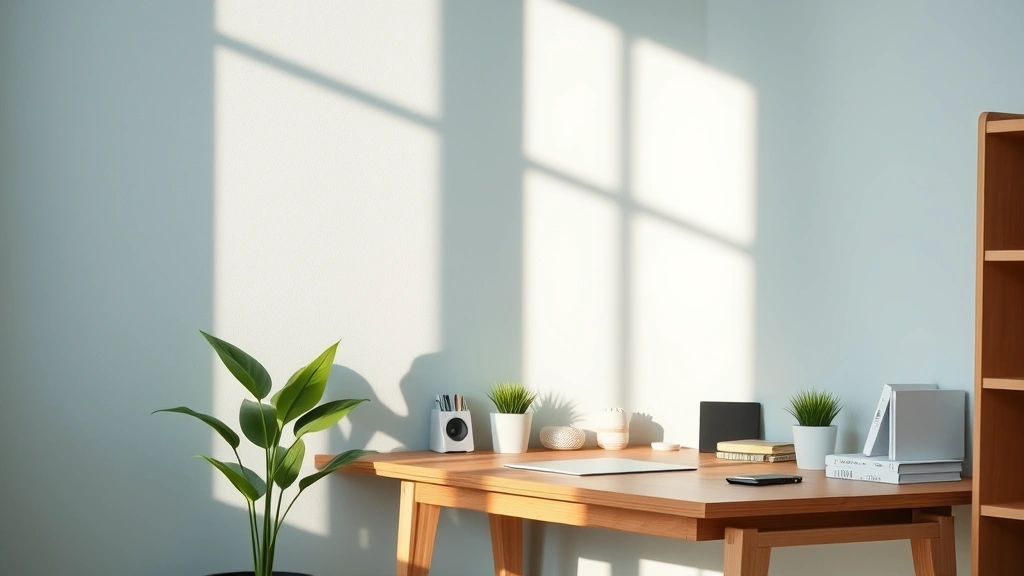
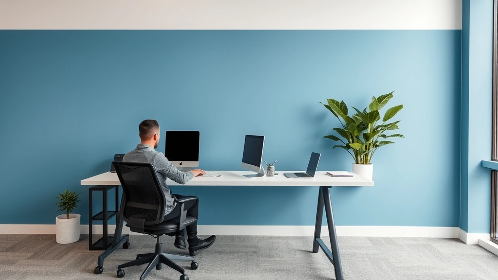
Start with wall colors as your foundation. Soft blue, light green, or neutral gray provide excellent backgrounds for focus work. If painting walls seems impractical, large fabric panels or removable wallpaper offer similar benefits. The key is establishing a base environment supporting the nervous system regulation necessary for deep work.
Next, evaluate your desk and immediate surroundings. A cluttered desk with multiple bright colors demands continuous visual processing, consuming working memory resources. Minimize visual stimulation by using matching desk accessories, organizing items into neutral containers, and removing unnecessary decorations. This creates what designers call “visual quiet,” allowing your attention to focus on actual work rather than environmental processing.
For those managing anxiety or seeking to improve mental health through environmental design, consider reading our article on calling out of work for mental health, which addresses how environmental factors contribute to overall wellness. Your workspace colors significantly influence whether you can maintain psychological equilibrium during demanding work.
Introduce strategic color accents that complement your base environment. A blue desk with green plants, for instance, creates a cohesive calming palette. Limit accent colors to 2-3 maximum; excessive variety defeats the purpose of color-based focus optimization.
Lighting quality interacts crucially with color choices. Natural light renders colors most accurately and provides the full spectrum your circadian rhythm requires. If natural light is limited, invest in full-spectrum lighting that approximates daylight. Under poor lighting, even well-chosen colors fail to deliver their psychological benefits.
Color Combinations for Optimal Cognitive Performance
Effective color schemes layer complementary hues rather than using single colors in isolation. Consider these evidence-backed combinations:
- Blue + Green: Combines focus enhancement with restorative properties, ideal for long work sessions. The blue supports sustained attention while green provides periodic mental recovery.
- Gray + Blue: Creates professional calm without appearing sterile. Gray anchors the environment while blue maintains alertness and reduces anxiety.
- Beige + Soft Green: Provides warm neutrality with nature-inspired restoration. This combination works particularly well for creative work requiring both focus and intuition.
- Light Blue + White: Maximizes perceived space and mental clarity. The high-value combination reduces visual strain and supports extended concentration.
- Gray + Muted Purple: Supports creative problem-solving while maintaining focus. The purple adds subtle stimulation without overwhelming the system.
Avoid these problematic combinations:
- Bright Red + White: Creates excessive contrast and visual strain, impairing sustained focus.
- Dark Blue + Dark Green: Reduces perceived brightness and can induce depressive responses during extended exposure.
- Yellow + Orange: Overstimulates and creates agitation rather than productive energy.
- Multiple Saturated Colors: Any combination using more than two highly saturated colors creates cognitive overload.
Your specific color choices should reflect your work type. If you engage in analytical work requiring sustained attention, prioritize cool colors (blues and greens). For creative work requiring intuitive leaps, add subtle warm accents. For administrative tasks with moderate cognitive demand, neutral bases with minimal accent colors work best.
Common Mistakes When Using Color for Focus
Mistake 1: Assuming Personal Preference Equals Optimal Focus—You might love bright orange, but that preference doesn’t mean orange supports your concentration. Color psychology involves objective neurological responses alongside subjective preferences. Find colors you tolerate well that also support your focus neurologically.
Mistake 2: Over-Personalizing Your Space—While personalization supports emotional well-being, excessive personal items in varied colors creates visual clutter. Balance self-expression with environmental simplicity; use one or two meaningful items rather than many.
Mistake 3: Ignoring Lighting Conditions—Colors appear dramatically different under various lighting. Test your chosen colors under your actual workspace lighting before committing to large changes. A color that looks perfect under natural light might appear different under fluorescent lights.
Mistake 4: Choosing Colors Without Testing Duration—Exposure duration matters enormously. A color might feel calming for five minutes but become oppressive after hours. Spend at least a week with a color before deciding it works for your focus needs.
Mistake 5: Neglecting Individual Neurobiology—Some people have heightened sensitivity to particular colors due to genetic variation in photoreceptor distribution or neurological conditions like synesthesia. What works for your colleague might not work for you. Experiment systematically to find your optimal palette.
For broader insights into optimizing your cognitive performance, explore our FocusFlowHub blog, which covers numerous evidence-backed strategies for enhancing concentration and mental health.
Additionally, if you’re interested in evidence-based approaches to building better habits around focus and productivity, our Atomic Habits review discusses how small environmental changes—including color choices—compound into significant performance improvements.
FAQ
What color is best for reducing anxiety and improving focus simultaneously?
Blue proves most effective for this dual purpose. It reduces anxiety by activating parasympathetic nervous system responses while simultaneously enhancing alertness and sustained attention. Light to medium blues work best; avoid very dark or extremely bright blues, which can feel overwhelming.
Can I use color to improve focus if I work in a space I don’t control?
Absolutely. You can introduce color through desk accessories, desk pads, monitor bezels, personal lighting, fabric panels, or even strategic placement of plants and artwork. Small-scale color interventions provide measurable benefits, though large-scale changes deliver stronger effects.
How long does it take to experience focus improvements from color changes?
Most people notice subtle improvements immediately, though significant changes typically manifest within 2-3 weeks as your nervous system adjusts to the new environment. Consistency matters—temporary color exposure provides minimal benefits compared to sustained environmental color changes.
Does color affect focus differently for different types of tasks?
Yes, significantly. Analytical tasks benefit most from cool colors (blue and green) supporting sustained attention. Creative tasks benefit from subtle warm accents (soft purple or muted orange) that promote intuitive thinking. Routine administrative tasks work well with neutral colors minimizing distraction.
Are there colors to absolutely avoid for focus work?
Avoid highly saturated, bright colors—particularly neon versions of any hue. Avoid high-contrast combinations like bright red on white. Avoid excessive color variety in your immediate workspace. These create visual processing demands that consume cognitive resources needed for actual work.
How does individual preference factor into color psychology for focus?
Individual preference matters, but it shouldn’t override neuroscientific principles. You might prefer red, but that doesn’t mean red supports your focus. Seek colors that both feel reasonably pleasant and align with evidence-backed focus-supporting palettes. The goal is optimizing performance, not maximizing preference.
Can I combine color changes with other focus strategies?
Color optimization works synergistically with other focus techniques. Combining color psychology with strategies discussed in best mental health books and resources on books for mental health creates multiplicative benefits. Color provides environmental support while other strategies address cognitive and emotional dimensions.
What role does lighting play in color effectiveness?
Lighting is absolutely critical. Colors appear different under various light sources, and lighting quality affects your circadian rhythm and nervous system state. Natural light remains ideal; if unavailable, use full-spectrum artificial lighting approximating daylight. Poor lighting undermines even optimal color choices.