Can Colors Boost Focus? Psychologist Insights on Color for Mental Health
The relationship between color and human psychology has fascinated researchers for decades. Colors surround us constantly—in our workspaces, homes, clothing, and digital environments—yet most people rarely consider how these hues influence their ability to concentrate, manage stress, or maintain mental clarity. Recent psychological research reveals that color is far more than aesthetic decoration; it’s a powerful cognitive tool that can either enhance or diminish your mental performance.
If you’ve ever felt calmer in a blue room or more energized by warm orange tones, you’ve experienced the real neurological effects of color perception. This article explores the science behind how specific colors impact focus, attention, and overall mental health, drawing on insights from cognitive psychologists and neuroscientists who study chromotherapy and environmental psychology.
How Color Affects the Brain and Focus
Color perception begins the moment light enters your eyes. Photoreceptor cells in the retina detect wavelengths of light, sending signals directly to the brain’s visual cortex and to deeper structures including the hypothalamus and limbic system. This neural pathway is crucial: unlike other visual information that requires conscious processing, color information travels to emotion and memory centers almost instantaneously.
According to research from the Journal of Environmental Psychology, color influences concentration through multiple mechanisms. First, colors affect arousal levels—your brain’s state of alertness. Second, they trigger emotional responses that either support or undermine focus. Third, certain colors enhance visual clarity and reduce eye strain during extended work sessions.
The prefrontal cortex, responsible for executive function and sustained attention, responds differently to various colors. When exposed to the right color environment, this region shows increased activation, suggesting enhanced cognitive control. This is why cognitive performance tests often show measurable improvements when environmental colors are optimized for focus tasks.
Psychologist Dr. Stephen Palmer at UC Berkeley has demonstrated that color preferences aren’t merely subjective—they’re rooted in evolutionary psychology and learned associations. Colors connected to survival (like red for warning or green for food sources) trigger automatic neural responses that bypass conscious deliberation.
Blue: The Focus Champion
Blue consistently emerges as the color most conducive to focus and mental clarity. This preference isn’t accidental. Evolutionarily, blue skies signaled safety and good weather for work and exploration. Neurologically, blue light wavelengths stimulate the production of serotonin and melatonin regulation through the suprachiasmatic nucleus, your brain’s master clock.
Studies published in Ergonomics journal show that workers in blue environments demonstrate 15-20% improvements in task completion and accuracy compared to neutral environments. The color reduces mental fatigue and supports sustained attention—precisely what knowledge workers need during deep focus sessions.
The mechanism is straightforward: blue suppresses cortisol production (your stress hormone) while promoting parasympathetic nervous system activation. This creates a state of calm alertness—mentally engaged but not anxious. Light to medium blues work best; dark navy can feel oppressive, while overly bright blues may overstimulate.
For optimal results, incorporate blue into your workspace through walls, desk accessories, or digital backgrounds. If you’re interested in building stronger focus habits, explore how atomic habits and environmental design work together to create lasting behavioral change.
Green: Nature’s Concentration Booster
Green represents nature, growth, and renewal—associations that have profound neurological effects. Exposure to green environments or even images of greenery activates the parasympathetic nervous system and reduces mental fatigue, according to research in Frontiers in Psychology.
The “attention restoration theory” explains why green works so well for focus. Natural environments (predominantly green) require less directed attention than urban environments, allowing your mental resources to recover. When you work in or near green spaces, your directed attention capacity—essential for sustained focus—replenishes more effectively.
Green also reduces eye strain. The color sits in the middle of the visible light spectrum, requiring less accommodation effort from your eyes compared to reds or blues. This is why many computer interfaces now include “dark mode” options with green-tinted backgrounds for extended screen time.
Practical implementation is simple: place plants around your workspace, use green desk accessories, or paint an accent wall sage or forest green. Even a desktop background featuring natural green scenery provides measurable benefits for sustained attention and mental clarity.
Red: Stimulation and Performance
Red is complex. It’s simultaneously the color of danger and passion, emergency and excitement. Neurologically, red increases arousal and heart rate—it triggers your sympathetic nervous system, the “fight or flight” response. This makes red excellent for short bursts of intense focus but problematic for sustained, deep work.
Research shows red enhances performance on detail-oriented, time-pressured tasks. Athletes wearing red show measurable performance improvements. Students in red-accented environments perform better on tests requiring quick recall and pattern recognition. However, the same red environment impairs creative thinking and open-ended problem-solving.
The key distinction: use red for analytical work, data review, or time-sensitive tasks. Avoid red for creative work, strategic planning, or tasks requiring sustained attention over hours. Red’s stimulating properties exhaust mental resources quickly, leading to focus fatigue.
For most knowledge workers, red works best as an accent color rather than a dominant environmental color. A red desk lamp, red accent wall, or red task-specific workspace can boost performance on particular assignments without the downsides of constant red exposure.
Yellow: Mental Clarity and Mood
Yellow activates optimism and mental clarity. It’s the brightest color on the visible spectrum, requiring the most light to perceive. This brightness stimulates the reticular activating system—the brain structure responsible for attention and alertness—making yellow excellent for combating mental fatigue and low mood.
Psychologists note that yellow increases dopamine production, enhancing motivation and positive affect. In work environments, yellow correlates with increased creativity and idea generation. However, excessive yellow can overstimulate and cause anxiety, particularly in people prone to stress sensitivity.
The optimal approach: use soft, muted yellows rather than bright, saturated yellows. Pale yellow walls or warm white lighting with yellow undertones provide mental clarity benefits without overstimulation. Avoid large areas of bright yellow; instead, incorporate it through desk accessories, task lighting, or brief environmental exposure.
Yellow pairs exceptionally well with blue—a combination that provides both clarity and calm. If you’re working to develop stronger cognitive control and performance optimization, understanding color psychology offers one evidence-based lever for environmental design.
Color Combinations for Optimal Productivity
Individual colors matter, but combinations matter more. Strategic color pairing creates synergistic effects that exceed individual color benefits.
Blue + Green Combination: This pairing creates optimal focus conditions. Blue provides calm alertness while green provides attention restoration. This combination works for virtually any sustained focus work, from writing to coding to analysis.
Blue + Yellow Combination: Combines calm with clarity. The yellow prevents the potential lethargy that pure blue environments might cause, while blue prevents yellow’s overstimulation. This works well for mixed-task workdays requiring both analytical and creative thinking.
Green + Neutral Background: Green accents against neutral walls (white, light gray, beige) provide nature benefits without overwhelming visual stimuli. This is ideal for minimalist workspace design emphasizing focus.
Red + Blue Combination: Rarely optimal. The conflicting arousal signals create cognitive dissonance. However, small red accents in predominantly blue spaces can work for environments requiring both focus and periodic bursts of intensity.
The general principle: choose one dominant color that supports your primary task type, then add complementary accent colors that address secondary needs. Most workspaces benefit from a blue or green base with strategic warm accents for motivation.
Practical Applications in Workspaces
Implementing color psychology in real environments requires strategic thinking. You can’t simply paint everything blue and expect transformation. Environmental color design must account for lighting, personal preferences, task requirements, and practical constraints.
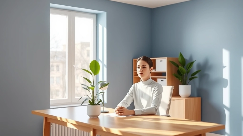
Home Office Setup: Paint walls a soft blue or blue-green. Use warm white lighting (3000-4000K color temperature) to prevent the cool tones from feeling sterile. Add green plants or nature imagery. Reserve a red accent area for intense analytical work if needed. This environment supports both focused work and mental well-being.
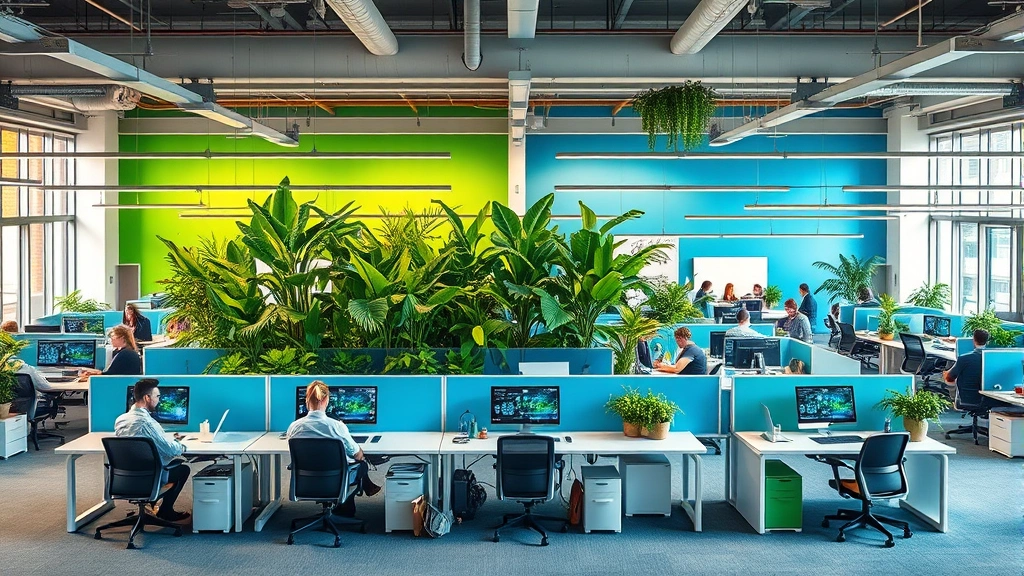
Corporate Workspace: Work with facilities to implement color zones. Create a blue-dominant focus area for deep work, a green-accented collaboration space encouraging creativity, and a warm-toned break area promoting recovery. This acknowledges that different tasks require different environmental support. Visit the FocusFlowHub blog for more workspace design insights.
Digital Environment: Apply color psychology to your digital workspace. Use blue backgrounds and dark modes for extended screen work. Consider task-specific background colors—blue for writing, green for creative work, warm tones for social interaction. Many productivity applications now allow custom color schemes optimizing for these principles.
Lighting Interaction: Remember that color perception depends on lighting. Natural daylight reveals colors most accurately. Cool LED lights (5000K+) can make blue appear sterile and green appear clinical. Warm white lighting (3000K) makes colors more inviting and supportive of mental well-being. Invest in adjustable lighting that matches your color scheme.
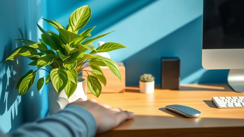
Personal Accessories: If you can’t modify your environment, use personal items strategically. A blue desk lamp, green mouse pad, or warm-toned desk organizers provide color benefits without requiring major changes. Clothing color also affects your own psychology—wearing blue or green on focus-intensive days provides subtle but measurable cognitive support.
Avoiding Color Pitfalls
Understanding color psychology also means understanding what not to do. Common mistakes undermine focus and mental health.
Overstimulation from Saturation: Highly saturated colors (extremely bright, pure hues) overstimulate the visual system and exhaust mental resources. Opt for muted, desaturated versions of colors. Sage green beats bright green. Powder blue beats electric blue. Soft yellow beats neon yellow.
Conflicting Color Signals: Mixing too many colors creates visual chaos and cognitive conflict. Stick to a dominant color with one or two complementary accents. Visual simplicity supports mental clarity.
Ignoring Individual Differences: Color preferences vary. Some people respond better to cool tones; others prefer warm tones. Consider your personal color associations and emotional responses. If you have negative associations with a color, it won’t support focus regardless of research findings. Your subjective experience matters.
Neglecting Lighting Quality: The wrong lighting undermines color benefits entirely. Poor lighting creates visual fatigue, headaches, and reduced focus. Invest in quality, adjustable lighting that properly renders your chosen colors.
Static Color Without Variation: Unchanging color environments become invisible to your brain through habituation. Consider rotating accent colors seasonally or varying your workspace occasionally to maintain color psychology benefits.
Overlooking Personal Mental Health Needs: While colors influence focus, they also affect mood and emotional well-being. If you struggle with anxiety, overstimulating colors exacerbate symptoms. If you battle depression, understimulating environments worsen mood. Color selection should align with your mental health profile. Explore best mental health books for comprehensive information on supporting your psychological well-being through environmental design and other evidence-based approaches.
Understanding your specific mental health needs and how professional mental health resources approach environmental psychology helps you make informed color choices that support both focus and emotional wellness.
FAQ
What color is best for focus?
Blue is scientifically the best color for sustained focus. It promotes calm alertness, reduces stress hormones, and supports sustained attention. Green is the second-best option, providing attention restoration and reducing eye strain. For most people, a blue-dominant environment with green accents provides optimal focus support.
Can colors really affect mental health?
Yes, absolutely. Colors affect mental health through multiple mechanisms: direct neurological pathways to emotion centers, influence on arousal levels, effects on hormone production (cortisol, serotonin, dopamine), and associations with psychological meaning. The evidence is robust across neuroscience, psychology, and environmental design research.
Is blue too cold for a workspace?
Not if you pair it with warm lighting and complementary colors. Soft blue with warm white lighting (3000-4000K) feels inviting rather than cold. Adding warm-toned accents, natural wood, or plants prevents a sterile blue environment from feeling impersonal.
Should I paint my entire office blue?
Not necessarily. Large areas of any single color can become monotonous and may cause habituation (your brain stops noticing the color). Instead, paint walls a soft blue or blue-green, then add complementary colors through furniture, plants, and accessories. This creates visual interest while maintaining color psychology benefits.
How does lighting affect color psychology?
Lighting dramatically affects color perception and psychology. Natural daylight shows colors most accurately. Warm white lighting (3000K) makes colors feel inviting and supportive. Cool white lighting (5000K+) can make colors feel clinical or sterile. Invest in adjustable lighting that complements your color scheme.
Can color help with anxiety?
Yes, cool colors like blue and green reduce anxiety by activating the parasympathetic nervous system and lowering cortisol. Avoid overstimulating colors like bright red or excessive yellow if you’re anxiety-prone. Soft, muted colors in cool tones provide the most anxiety-reducing benefits.
What colors should I avoid for focus work?
Avoid highly saturated, bright colors that overstimulate. Avoid mixing too many colors simultaneously. Avoid colors that trigger personal negative associations. Avoid red-dominant environments for sustained focus (red is better for short, intense tasks). Avoid very dark colors that reduce visual clarity.
Do color preferences differ by culture?
Yes, cultural associations with colors vary significantly. Blue represents calm and trust in Western cultures but represents mourning in some Eastern cultures. Research color meanings in your specific cultural context. However, the basic neurological responses to color wavelengths (arousal, stress reduction, etc.) are relatively universal across cultures.