Best Colors for Focus? Designer Insights on Productivity and Mental Wellness
Color science has evolved dramatically over the past two decades, transforming from aesthetic preference into measurable neurological impact. The colors surrounding your workspace don’t just look appealing—they actively influence your brain’s ability to concentrate, regulate stress, and maintain mental clarity. Designers, neuroscientists, and productivity experts now agree that strategic color selection is one of the most underutilized tools for enhancing focus and supporting mental health.
The relationship between color and cognition operates through multiple biological pathways. Light wavelengths trigger specific responses in your retinas, which communicate directly with your brain’s limbic system and prefrontal cortex—the regions responsible for attention, emotional regulation, and executive function. When you understand how different hues affect these neural pathways, you gain the ability to design your environment intentionally. Whether you’re struggling with concentration, managing anxiety, or seeking to optimize your productivity, the right color palette can serve as a foundational element of your wellness strategy.
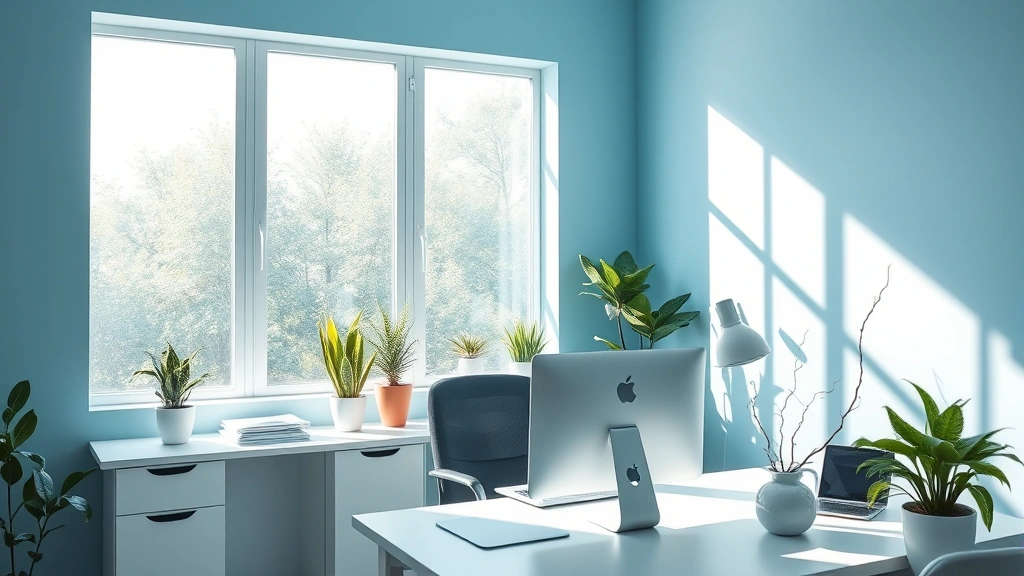
Blue: The Science-Backed Focus Color
Blue dominates the conversation around productivity colors, and research substantiates this preference. Studies published in cognitive psychology journals demonstrate that blue environments enhance analytical thinking, logical reasoning, and sustained attention. This occurs because blue wavelengths stimulate the production of serotonin and dopamine—neurotransmitters essential for motivation and mood regulation. The color essentially primes your brain for deep work.
The effectiveness of blue extends beyond simple preference. Research on color and cognitive performance shows that individuals working in blue-tinted environments complete complex tasks faster and with fewer errors than those in neutral spaces. This advantage becomes particularly pronounced during extended focus sessions lasting 90 minutes or longer. The color’s association with sky and water—elements humans instinctively find calming—creates a psychological foundation that supports concentration without inducing drowsiness.
However, not all blues perform identically. Navy and deep blue tones promote serious focus and professional attention, making them ideal for analytical work, writing, and problem-solving. Lighter sky blues introduce a more relaxed focus state, suitable for creative thinking and brainstorming. Saturated, bright blues can overstimulate, particularly in individuals sensitive to visual intensity. When implementing blue in your workspace, consider the specific type of work you’ll perform and choose the shade accordingly.
Many designers recommend pairing blue with neutral tones rather than using it as the sole color. A blue accent wall combined with beige, gray, or white creates visual balance that sustains attention without fatigue. This approach aligns with productivity research on optimal environmental design, where variety prevents habituation—the phenomenon where your brain stops noticing constant stimuli.

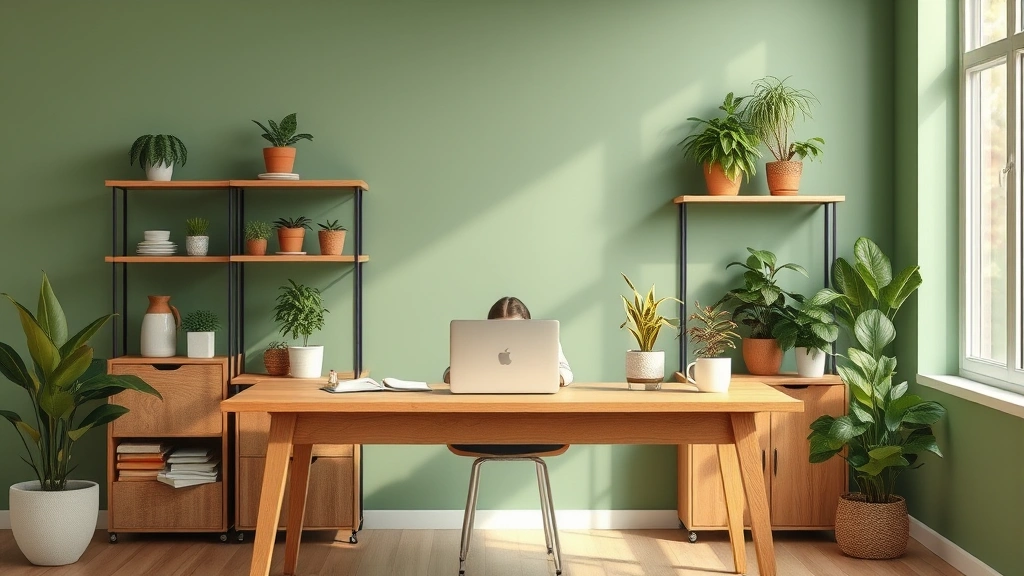
Green: Nature’s Calming Influence
Green represents the intersection of focus and calm, making it exceptionally valuable for mental health and sustained concentration. The color’s association with nature triggers biophilic responses—innate human preferences for natural environments. When your brain perceives green, it activates the parasympathetic nervous system, the physiological branch responsible for relaxation and recovery.
The mental health benefits of green extend to stress reduction and anxiety management. Research in environmental psychology demonstrates that exposure to green spaces and green-colored environments reduces cortisol levels—the primary stress hormone. This neurochemical shift creates conditions where focus becomes effortless because your brain isn’t allocating resources to threat detection and stress response. Instead, mental energy remains available for the task at hand.
Green’s effectiveness for mental health makes it particularly valuable if you experience anxiety, perfectionism, or high-pressure work environments. Unlike blue, which sharpens analytical thinking, green supports balanced cognition. It enhances creative problem-solving while maintaining emotional stability. This combination proves especially beneficial for professionals juggling multiple priorities or managing complex projects where both innovation and emotional regulation matter.
Sage green, muted green, and olive tones work better than bright, neon greens for sustained focus. The softer palettes maintain the calming benefits while avoiding the visual stimulation that can distract from deep work. Many designers now recommend green for break spaces and secondary work areas, creating psychological recovery zones within your physical workspace. This strategy aligns with neuroscience research on attention restoration theory, which shows that brief exposures to calming colors significantly enhance subsequent focus performance.
For those seeking to deepen their understanding of mental health support, exploring resources like best mental health books can complement environmental optimization strategies.
Warm Colors and Mental Energy
Warm colors—oranges, reds, and warm yellows—occupy a different neurological niche than cool colors. Rather than promoting calm focus, they stimulate energy, motivation, and emotional engagement. For certain types of work and mental health applications, this stimulation proves invaluable.
Orange specifically enhances enthusiasm and social connection. It increases heart rate and metabolism without triggering the stress response associated with red. Designers frequently recommend orange for collaborative spaces, creative studios, and environments where interpersonal energy matters. The color supports mental health by combating apathy and low motivation—conditions that often accompany depression and seasonal affective disorder. If you struggle with initiating tasks or maintaining enthusiasm, orange can serve as a neurochemical ally.
Red demands careful application. While it enhances physical performance and draws attention, sustained exposure to red can elevate stress levels and impair fine motor skills. This makes red problematic for detail-oriented work or focus-intensive tasks. However, brief red exposure can jumpstart motivation and accelerate decision-making. Strategic use—such as a red accent object on your desk rather than red walls—leverages these benefits while minimizing downsides.
Warm yellows promote optimism and mental clarity. Unlike orange’s social energy, yellow emphasizes intellectual brightness. It enhances memory formation and pattern recognition, making it valuable for learning environments and spaces where information retention matters. However, like red, intense yellow can overstimulate. Muted, warm yellow tones work better than bright, saturated versions.
The key principle with warm colors: use them strategically rather than as dominant environmental colors. A warm-colored accent chair, desk accessory, or wall section provides motivational benefits without creating overstimulation. This approach aligns with behavioral science principles around habit formation, where environmental cues trigger specific psychological states.
Color Psychology Beyond the Basics
Individual variation significantly impacts color response. Cultural background, personal history, and neurological differences mean that colors don’t produce identical effects across all people. Someone with positive childhood associations with orange will experience that color differently than someone with negative associations. Recognizing this variability helps you move beyond generic color advice toward personalized environmental design.
Saturation and value—the brightness and intensity of color—matter as much as hue. Muted, desaturated colors generally support focus better than bright, saturated versions. This principle applies across the spectrum. Soft sage green outperforms bright lime green for sustained attention. Muted navy blue works better than electric blue. Desaturated tones reduce visual noise and prevent overstimulation, particularly important for individuals with sensory sensitivity or ADHD.
Contrast also influences focus capacity. High-contrast environments—black text on white, for instance—enhance visual acuity but can create eye strain during extended sessions. Medium-contrast combinations, such as dark gray text on light beige, provide readability while reducing fatigue. This principle extends to wall colors and accent colors. Too much contrast between surrounding colors creates visual tension; insufficient contrast leads to monotony and reduced engagement.
Lighting dramatically modifies color perception and impact. The same blue appears different under cool white LED lighting versus warm incandescent lighting. Daylight renders colors more naturally than artificial light. This means your color strategy must account for your specific lighting conditions. If your workspace relies on fluorescent overhead lighting, you may need to adjust color selections to compensate for the cool cast that fluorescents introduce.
For individuals managing mental health challenges, understanding these nuances becomes particularly important. Taking time to address mental health needs includes optimizing your physical environment. The cumulative effect of thoughtful color selection, appropriate saturation, good contrast, and suitable lighting creates a foundation that supports both focus and emotional wellbeing.
Practical Implementation Strategies
Implementing color psychology doesn’t require complete environmental renovation. Strategic, low-cost interventions can yield significant benefits. Start by identifying your primary work focus type. Are you engaged in analytical work requiring sustained concentration? Blue becomes your priority color. Do you manage anxiety or need emotional stability? Green should dominate. Are you struggling with motivation and energy? Warm tones warrant consideration.
Begin with paint or wallpaper in one area—perhaps your main work wall or a single accent wall. Choose a muted, medium-saturation version of your target color. Allow yourself 2-3 weeks to assess the impact before making additional changes. Your brain requires time to adapt, and initial impressions often differ from long-term effects.
If permanent changes aren’t feasible, use removable wallpaper, fabric panels, or strategic furniture placement to introduce color. A blue throw blanket over your chair, green desk accessories, or warm-toned artwork can create localized color zones that influence your mental state without major commitment.
Lighting deserves equal attention to wall color. If possible, maximize natural daylight exposure. Position your desk near windows and use light-filtering shades rather than blackout curtains. For artificial lighting, select warm white (2700K-3000K) bulbs for relaxation areas and cool white (4000K-5000K) for focus spaces. This mirrors natural circadian patterns and supports both concentration and sleep quality.
Combine color strategy with other focus-enhancing practices. Exploring literature on discipline and focus can provide complementary strategies that work synergistically with environmental optimization. Color creates the neurological foundation; behavioral practices build the structure of sustained attention.
Monitor your subjective experience. Notice whether you feel more focused, calmer, or more energized in your color-modified space. Track your actual productivity metrics—work completed, errors made, time to task initiation. Objective data reveals whether the color change produced meaningful impact for your specific brain chemistry and work patterns.
Consider seasonal adjustments. Research on seasonal affective disorder demonstrates that color needs shift with seasons. Winter months may warrant warmer tones or increased yellow exposure to combat seasonal mood decline. Summer may allow you to lean more heavily into cool blues and greens. This dynamic approach treats your environment as an evolving tool rather than a static design.
FAQ
What color is best for focus and concentration?
Blue stands out as the most research-supported color for focus. It enhances analytical thinking and reduces errors on complex tasks. However, the best color depends on your specific work type. Blue suits analytical work, green supports balanced focus with calm, and warm colors boost motivation. Identify your primary need and choose accordingly.
Can colors really affect mental health?
Yes. Colors influence mental health through multiple pathways: light wavelengths affect neurotransmitter production, color associations trigger emotional responses, and environmental colors shape stress levels and mood. The effects are measurable through cortisol levels, attention performance, and self-reported wellbeing. Color alone doesn’t replace treatment for mental health conditions, but it meaningfully impacts psychological functioning.
Is blue better than green for focus?
Blue excels for analytical, detail-oriented focus. Green supports balanced focus while promoting calm and stress reduction. Choose blue if you need sharp, intense concentration. Choose green if you experience anxiety or need to maintain focus without tension. Many people benefit from using both—blue for primary work areas, green for break spaces.
What colors should I avoid for a focus workspace?
Bright red, neon yellow, and high-saturation colors generally impair sustained focus. These colors overstimulate and can elevate stress. Avoid using them as dominant colors. Gray and beige, while neutral, can feel monotonous and reduce engagement. Balance neutral tones with subtle color accents.
How long does it take to notice color effects?
Initial psychological responses occur within minutes—blue can feel calming immediately. However, neurological adaptation and measurable cognitive effects typically emerge over 2-3 weeks. Allow at least this timeframe before assessing whether a color change improved your focus or mental health.
Can I use multiple colors in my workspace?
Yes. Strategic color combinations work better than single-color environments. Pair a dominant color (blue or green) with neutral tones and small warm accents. This approach prevents monotony while maintaining focus benefits. Ensure colors don’t clash and that saturation levels remain moderate to avoid overstimulation.
Does lighting affect how colors influence focus?
Absolutely. The same color appears different under various lighting conditions and produces different neurological effects. Warm lighting modifies cool colors’ impact. Fluorescent lighting creates a different color perception than natural daylight. Optimize both color and lighting together for maximum benefit.