
Colors and Focus: Do They Enhance Concentration?
The relationship between color and human cognition has fascinated researchers for decades, yet many of us overlook one of the most accessible tools for improving focus: the strategic use of color in our environments. Whether you’re working from home, studying for exams, or managing a creative project, the colors surrounding you may be silently influencing your ability to concentrate. This comprehensive guide explores the science behind color psychology and reveals which hues can genuinely enhance your mental clarity and focus.
Understanding how colors affect our brain isn’t merely about aesthetic preferences—it’s about leveraging neuroscience to optimize your productivity. Our eyes contain millions of photoreceptors that transmit signals to our brain, triggering both physiological and psychological responses. These responses can either support deep concentration or create unnecessary distractions. By learning which colors promote focus and which ones hinder it, you can transform your workspace into a concentration powerhouse.
The intersection of colors for mental health and cognitive performance deserves serious attention, especially as remote work becomes increasingly common. Your choice of wall paint, desk accessories, and lighting can make the difference between a productive day and one filled with scattered thoughts and diminished output.
How Color Affects the Brain and Focus
Color perception begins the moment light enters your eyes, but the journey to concentration enhancement happens deep within your brain’s limbic system. According to research published in the journal Nature Neuroscience, different wavelengths of light activate distinct neural pathways that influence mood, alertness, and cognitive function. The wavelength of a color determines how your brain processes it—shorter wavelengths (blues and greens) activate different neural regions than longer wavelengths (reds and yellows).
The relationship between color and focus operates through multiple mechanisms. First, colors influence your circadian rhythm and melatonin production, which directly affects alertness levels. Second, they trigger emotional responses that either support or undermine concentration. Third, they can reduce visual strain and eye fatigue, allowing you to maintain focus for extended periods. Understanding these mechanisms helps explain why some colors feel naturally conducive to work while others make concentration feel nearly impossible.
Research from the American Psychological Association demonstrates that color preferences aren’t merely subjective—they’re rooted in evolutionary biology. Our ancestors associated certain colors with safety, food, and danger, and these ancient neural pathways still influence our modern brain responses. When you sit in a blue environment, your brain recognizes it as calm and secure, allowing your prefrontal cortex (responsible for executive function and focus) to operate at peak efficiency.
The neurotransmitter dopamine plays a crucial role in attention and motivation. Certain colors stimulate dopamine release more effectively than others, which is why choosing the right color palette can feel like providing your brain with natural cognitive enhancers. This scientific understanding transforms color selection from a decorative choice into a performance optimization strategy.
Blue: The Concentration Champion
Among all colors, blue consistently emerges as the most effective hue for enhancing focus and concentration. Studies conducted at the University of Rochester found that exposure to blue light increases alertness and improves cognitive performance on complex tasks. The color blue has a wavelength of approximately 450-495 nanometers, which directly stimulates the production of serotonin and supports the suppression of melatonin during work hours.
Blue environments reduce anxiety and create a sense of calm stability that allows your mind to settle into deep work. This is why many tech companies and modern offices feature blue in their design schemes. The color doesn’t overstimulate your visual system, making it possible to maintain focus for hours without experiencing the fatigue that comes from more vibrant hues. Additionally, blue is associated with trust, reliability, and intelligence—psychological associations that can subtly enhance your confidence in your work.
The effectiveness of blue varies slightly depending on shade. Lighter blues (sky blue, powder blue) promote relaxation and creativity, making them ideal for brainstorming sessions. Deeper blues (navy, cobalt) enhance analytical thinking and serious concentration, making them perfect for detail-oriented work. If you’re struggling with maintaining focus throughout your workday, consider incorporating blue elements into your workspace—whether through wall color, desk accessories, or even your background on video calls.
Interestingly, the National Center for Biotechnology Information has documented that blue light exposure in the morning and afternoon can shift your circadian rhythm, promoting better sleep quality at night. This means a blue-enhanced workspace doesn’t just improve immediate focus—it can enhance your sleep architecture, which further amplifies concentration the following day. This creates a positive feedback loop where your environment actively supports sustained cognitive performance.
Green: Nature’s Calming Influence
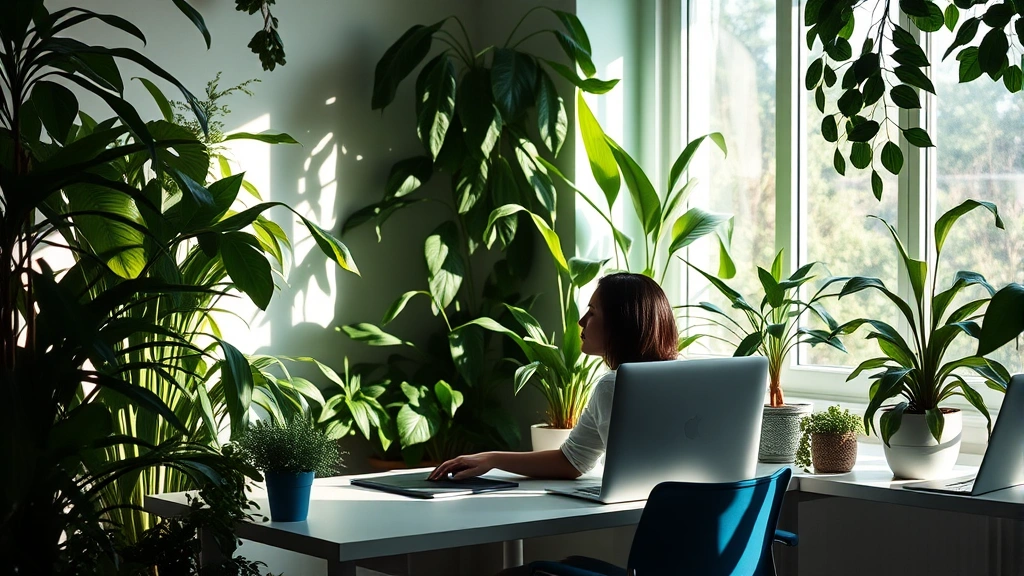
Green represents the second most effective color for concentration, and its benefits are particularly profound for stress reduction and sustained attention. Our evolutionary connection to nature means that green environments trigger the parasympathetic nervous system—your body’s relaxation response. When your nervous system is calm rather than activated, your prefrontal cortex has more metabolic resources available for complex thinking and sustained focus.
Research on biophilic design in Environmental Research shows that even viewing images of green spaces or having plants in your workspace can reduce stress hormones like cortisol. Lower cortisol levels directly correlate with improved focus and memory retention. Green also provides a visual rest for your eyes—the wavelength of green (495-570 nanometers) falls in the middle of the visible spectrum, requiring minimal eye strain adjustment compared to other colors.
The psychological associations of green are equally powerful. Green symbolizes growth, renewal, and balance—mental states that support productive work. Unlike blue, which can sometimes feel cool or distant, green feels warm and inviting while maintaining the calm necessary for concentration. This makes green an excellent choice for environments where you need both focus and creativity, such as design studios or research labs.
If you’re exploring how to optimize your environment for colors for mental health, green offers benefits beyond mere focus. It reduces eye strain during extended screen time, lowers anxiety levels, and creates a psychologically restorative environment. Many productivity experts recommend pairing green walls with natural light or adding live plants to create a workspace that naturally supports concentration and emotional wellbeing.
Red: Stimulation with Caution
Red is perhaps the most misunderstood color in the context of focus and concentration. While red is undeniably stimulating—it increases heart rate, blood pressure, and adrenaline—this stimulation can either enhance or severely impair your ability to concentrate, depending on context and duration of exposure.
For detail-oriented tasks requiring precision and accuracy, red can actually enhance performance. Studies show that brief exposure to red improves accuracy on proofreading tasks and error detection. This is because red activates your brain’s threat detection system, making you more vigilant and careful. However, this heightened vigilance comes at a cognitive cost—sustained red exposure increases anxiety and mental fatigue, making it unsuitable for long-term focus work.
The key to using red effectively for focus is strategic and limited application. Rather than painting an entire office red, consider using red as an accent color for areas where you need heightened alertness and precision. A red desk lamp, red folder for important documents, or red border on your workspace can provide the focus boost without the anxiety that comes from immersion in red.
Red also stimulates appetite and emotional intensity, which is why it’s avoided in meditation spaces and preferred in restaurants. If your goal is calm, sustained concentration over hours, red should be minimized in your primary work environment. Save it for moments when you need a cognitive jolt or are tackling particularly challenging analytical tasks.
Yellow and Orange: Energy and Creativity
Yellow and orange occupy an interesting position in the color-focus spectrum. Both colors stimulate mental activity and promote creative thinking, making them valuable for brainstorming sessions and innovative work. Yellow specifically increases mental processing speed and optimism, which can enhance motivation and reduce procrastination. The color yellow has a wavelength of 570-590 nanometers and stimulates the release of serotonin, the neurotransmitter associated with happiness and wellbeing.
However, yellow and orange can be overstimulating if used excessively. Prolonged exposure to bright yellow can increase anxiety and mental agitation, making it unsuitable as a primary workspace color for sustained focus work. Instead, these colors work best as accent elements or in environments where creative energy is the priority over deep analytical concentration.
The ideal approach involves using yellow and orange strategically. Incorporate them in brainstorming spaces, creative studios, or areas designated for idea generation. Pair them with calming colors like blue or green to balance their stimulating effects. A yellow desk lamp or accent wall can energize your creative thinking without overwhelming your nervous system.
For individuals working in fields that require both analytical focus and creative innovation, a balanced color palette incorporating touches of yellow with predominant blue or green creates an optimal cognitive environment. This approach leverages the energy of yellow while maintaining the concentration-supporting qualities of cooler tones.
Creating Your Focus-Friendly Workspace
Implementing color psychology in your workspace requires a strategic approach that considers your specific work demands, natural light conditions, and personal preferences. Begin by assessing your primary work activities. If you spend most of your time on analytical tasks, detailed work, or reading, blue should be your foundational color choice. If you work in creative fields, incorporate touches of yellow or orange while maintaining a base of green or blue.
Lighting dramatically affects how colors influence your focus. Natural daylight reveals colors most accurately and supports circadian rhythm alignment. If your workspace lacks natural light, invest in full-spectrum lighting that approximates daylight. This ensures that your chosen colors deliver their intended neurological benefits rather than appearing distorted and potentially counterproductive.
Consider the principle of color layering: establish a calm, focus-supporting base color (blue or green) for walls and large surfaces, then add accent colors based on your specific needs. This approach prevents the overwhelming effect of being completely immersed in stimulating colors while still providing color-psychology benefits. A predominantly blue office with green plants and strategic red accents for detail-work areas represents an optimally balanced workspace.
Your personal color preferences matter more than you might think. While color psychology provides evidence-based guidelines, working in an environment you find visually unappealing will ultimately undermine focus. The goal is finding colors that align with both psychological research and your individual preferences. If you find blue depressing rather than calming, that emotional response will override any neurological benefits.
Explore the concept of coloring pages for mental health as another avenue for understanding which colors genuinely support your mental state. Engaging in coloring activities provides insight into which colors you’re naturally drawn to and which ones create positive emotional responses. This self-knowledge becomes invaluable when designing your work environment.
Color Combinations for Optimal Concentration
The most effective workspaces rarely rely on a single color. Instead, they employ strategic color combinations that leverage the strengths of multiple hues while minimizing their weaknesses. Understanding these combinations helps you create an environment that supports sustained focus across varied work tasks.
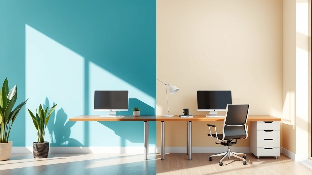
Blue and Green Combination: This pairing represents the gold standard for concentration-focused environments. Blue provides the calm alertness necessary for focused work, while green adds a restorative, stress-reducing element. The combination feels balanced, professional, and naturally conducive to extended periods of concentration. Many research institutions and high-performance workspaces use this combination because it supports both analytical thinking and creative problem-solving.
Blue with Warm Accent Colors: Pairing cool blue with warm accent colors (soft yellow, warm white, or light orange) creates visual interest while maintaining focus. The warm accents prevent the space from feeling cold or sterile, which can paradoxically reduce motivation. This combination works particularly well in home offices where you want professional focus without sacrificing comfort.
Green with Neutral Tones: Combining green with whites, grays, or beiges creates a clean, organized aesthetic that supports concentration. The green provides psychological restoration, while neutral tones offer visual simplicity that reduces cognitive load. This combination is ideal for minimalist workspaces and environments where reducing visual distraction is the priority.
Avoiding Problematic Combinations: Certain color pairings actively undermine focus. Red and orange together create overstimulation. Multiple bright, saturated colors compete for attention and increase cognitive load. Purple (particularly bright purple) can feel chaotic without proper balance. The principle here is simplicity—the fewer colors competing for your attention, the easier it is to focus.
Implementing these combinations doesn’t require expensive renovations. Start with your largest surface—typically walls—and establish your base color. Then add accent colors through furniture, artwork, plants, and accessories. This modular approach allows you to experiment with combinations before committing to permanent changes.
Frequently Asked Questions
Do color preferences vary by individual personality type?
Yes, research suggests that personality traits correlate with color preferences. However, the neurological effects of color—such as blue’s calming influence on the parasympathetic nervous system—remain consistent across individuals. While you might prefer red as a personal color, blue will still objectively enhance your focus. The strategy is honoring your preferences while strategically applying colors that support your concentration goals.
Can I use color psychology to improve focus while working remotely?
Absolutely. Remote work actually provides an ideal opportunity to implement color psychology since you have complete control over your environment. Consider your video background, the color of your desk, wall colors, and even the colors of your desk accessories. These elements collectively influence your focus and are visible to you throughout your workday.
Does the saturation of color matter for concentration?
Significantly. Highly saturated, bright colors are more stimulating and fatiguing than muted, desaturated versions of the same hue. For sustained focus work, opt for muted or pastel versions of focus-supporting colors. Bright, saturated colors work better for short bursts of activity or creative brainstorming rather than extended concentration sessions.
How long does it take for color changes to affect my focus?
Color psychology effects are relatively immediate. You’ll likely notice mood and alertness shifts within minutes of entering a differently colored environment. However, the sustained productivity benefits develop over days and weeks as your nervous system adapts to the new color environment and your circadian rhythms adjust accordingly.
Can I combine color psychology with other focus-enhancement strategies?
Definitely. Color psychology is most effective when combined with other evidence-based focus techniques. Pairing your optimized color environment with strategies like the FocusFlowHub Blog recommendations for deep work, proper lighting, and ergonomic setup creates a comprehensive approach to concentration optimization. Color is one powerful variable among many that influence your ability to maintain focus.
What’s the relationship between color psychology and mental health awareness?
Understanding how colors affect our cognition and emotions is a crucial component of mental health awareness. Colors can reduce anxiety, support emotional regulation, and create environments that promote psychological wellbeing. This connection between color and mental health is why colors for mental health awareness has become increasingly important in workplace design, therapeutic settings, and personal wellness practices.
Should I change my color environment seasonally?
While not necessary, seasonal adjustments can support your wellbeing. Many people benefit from warmer accent colors during winter months when natural light is limited, and cooler colors during summer when heat and light are abundant. Experimenting with seasonal color shifts allows you to maintain optimal focus year-round while adapting to changing environmental conditions.
The science of color and focus reveals that your environment is far more than an aesthetic backdrop—it’s an active participant in your cognitive performance. By strategically implementing color psychology, you create a workspace that naturally supports sustained concentration, reduces mental fatigue, and enhances your overall productivity. Whether you’re optimizing a home office, redesigning a corporate workspace, or simply adding colored elements to your current environment, remember that the most effective color scheme is one that combines scientific evidence with personal preference, creating a space where focus feels natural and achievable.